
Creative Brief
Case Study
A new grocery shopping experience for busy people
Role and Responsibilities
User Research, UX Design, UX Strategy, Interaction Design, Usability Testing
Project Scope
Instashop believes that there is a huge market out there for online grocery shopping. As a UX designer, I introduce the design thinking process to deliver a successful product for both the business and shoppers.
STEP1 - Empathize
Research Plan
Goals: The goal is to find out how many people who do grocery shopping in the stores are consider a switch to online grocery shopping and why they are interested it to do so.
Methods: Questionnaires and interviews
Participants: 21+ years, people who do grocery shopping weekly or bi-weekly.
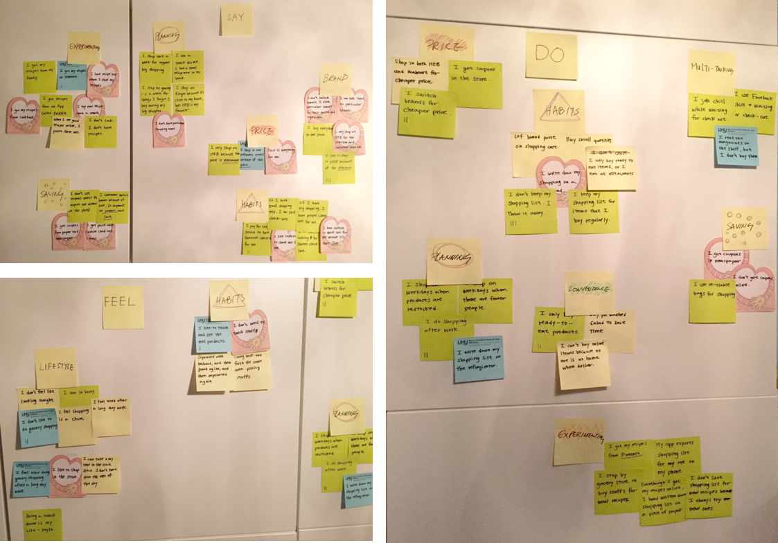
Empathy Map
I used the data collected during contextual inquiry in the empathize phase to created empath map for my users. I have total five users and I wrote down each one with what they say, think, feel, do, and any insight and need they have.
The individual empathy map is then transferred into post-it-notes and categorized into one big empathy map. The purpose of the empathy map is to find out the insights from users. Thus, I can create a product that suites what my users’ need and want.
STEP 2 - Define
Feature Matrix
Using feedback from the contextual inquiry, I created a loose feature matrix list summarizing what the product does and how does it work. The list also prioritize the features based on the level of the importance to the business and the users. Thus, product roadmap is effectively planed out.

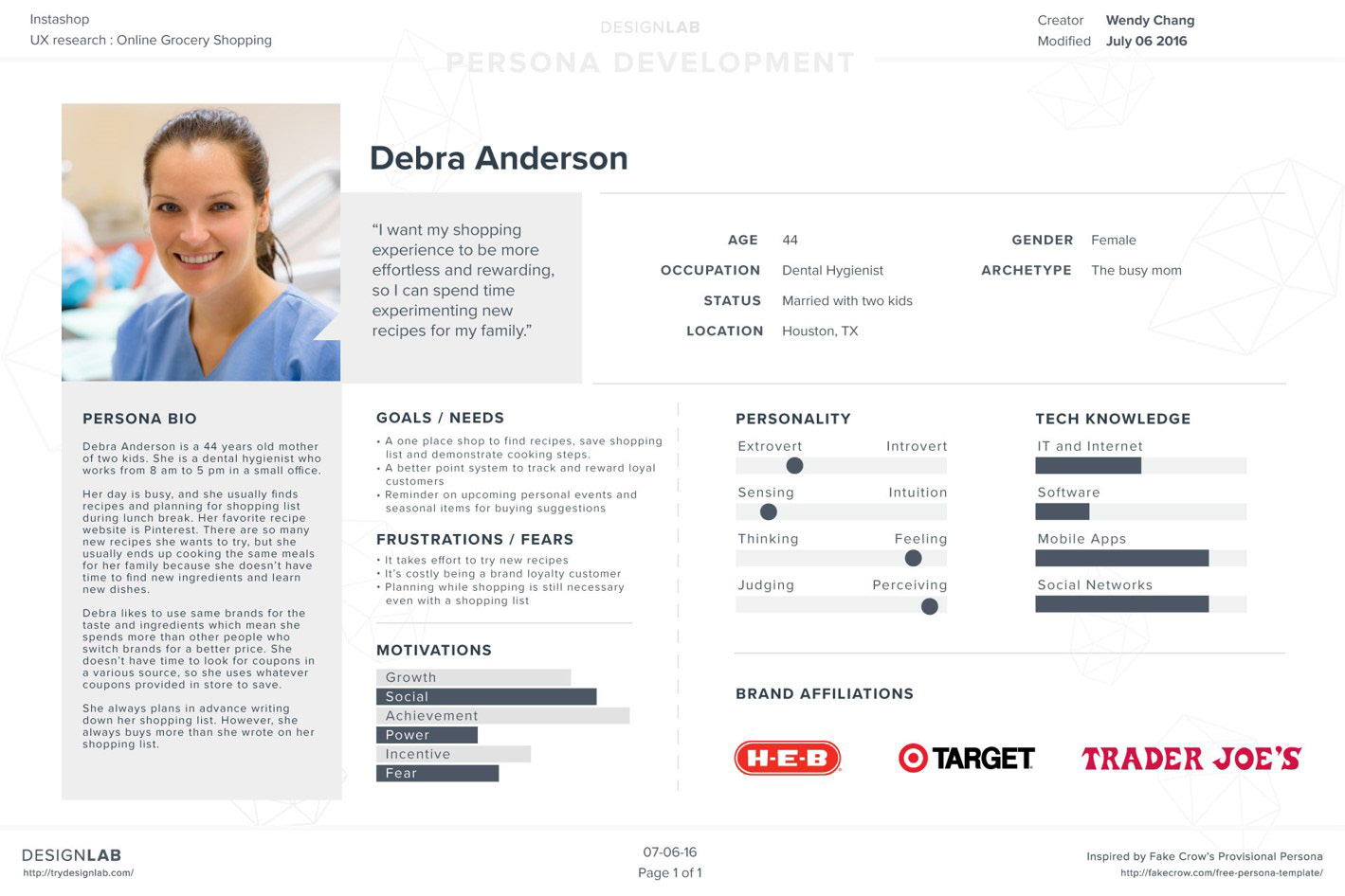
Persona
User personas are realistic representations of the key audience segments for the product/service. The goal of personas is not to represent every possible audience member but rather to address the major needs of the most important user groups.
I created Debra Anderson based on the empathy map findings.
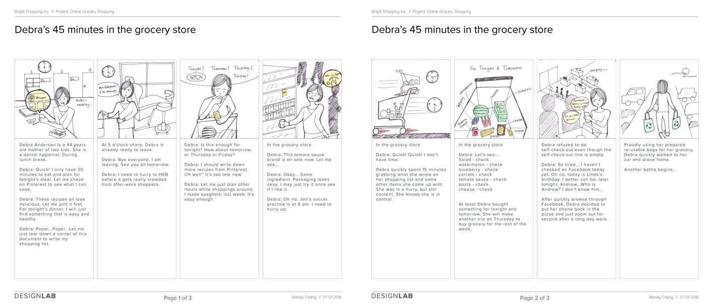
Story Board
Story board is one good way to visualized the persona I created. The story is about Debra’s day planning for meal and her short 45 minutes in the grocery store. I tried to illustrated Debra’s behavior and what she wishes to change.
Competitor Analysis
Competitor analysis gave me a deeper understanding of my problem space, by looking at how other companies currently trying to solve the problem.
I list out the main feature from two online grocery shopping companies, Instacart and Burpy, and put them into a 2x2 matrix (the two axes are: difficulty to implement a feature, and value of that feature to users).
I list out the main feature from two online grocery shopping companies, Instacart and Burpy, and put them into a 2x2 matrix (the two axes are: difficulty to implement a feature, and value of that feature to users).

STEP 3 - Ideate
Information Architecture
Information Architecture is the structural design of an interface that allows a user to access the right content at the optimal time so that she can navigate the product most effectively.
This is a core part of the job as UX designer. To share the knowledge of Information Architecture, I put together a short writing and published online. Learn More.
This is a core part of the job as UX designer. To share the knowledge of Information Architecture, I put together a short writing and published online. Learn More.

Card Sorting
The goal for card sorting exercise is to see how the research participants naturally organize the items for the online grocery shopping site. Thus, the design can effectively reflect how the information should be organized.
I have three participants doing card sorting exercise for me. The result is reflected on the site map design.

Site Map Wireframe User Flow
I combined site map, wireframe and user flow together and deliver a informative design showing how the product should be organized and how the shoppers navigate to different pages.

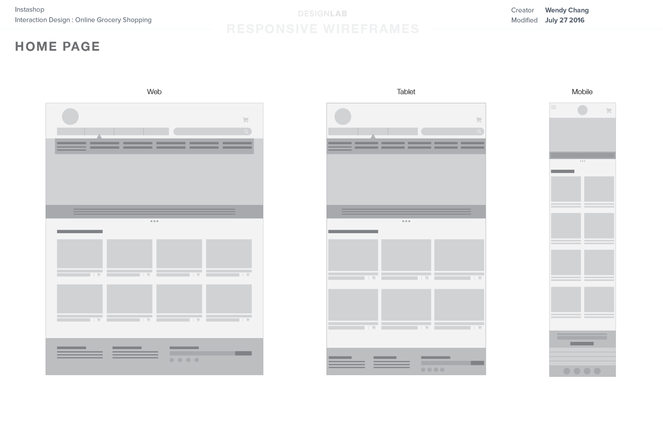
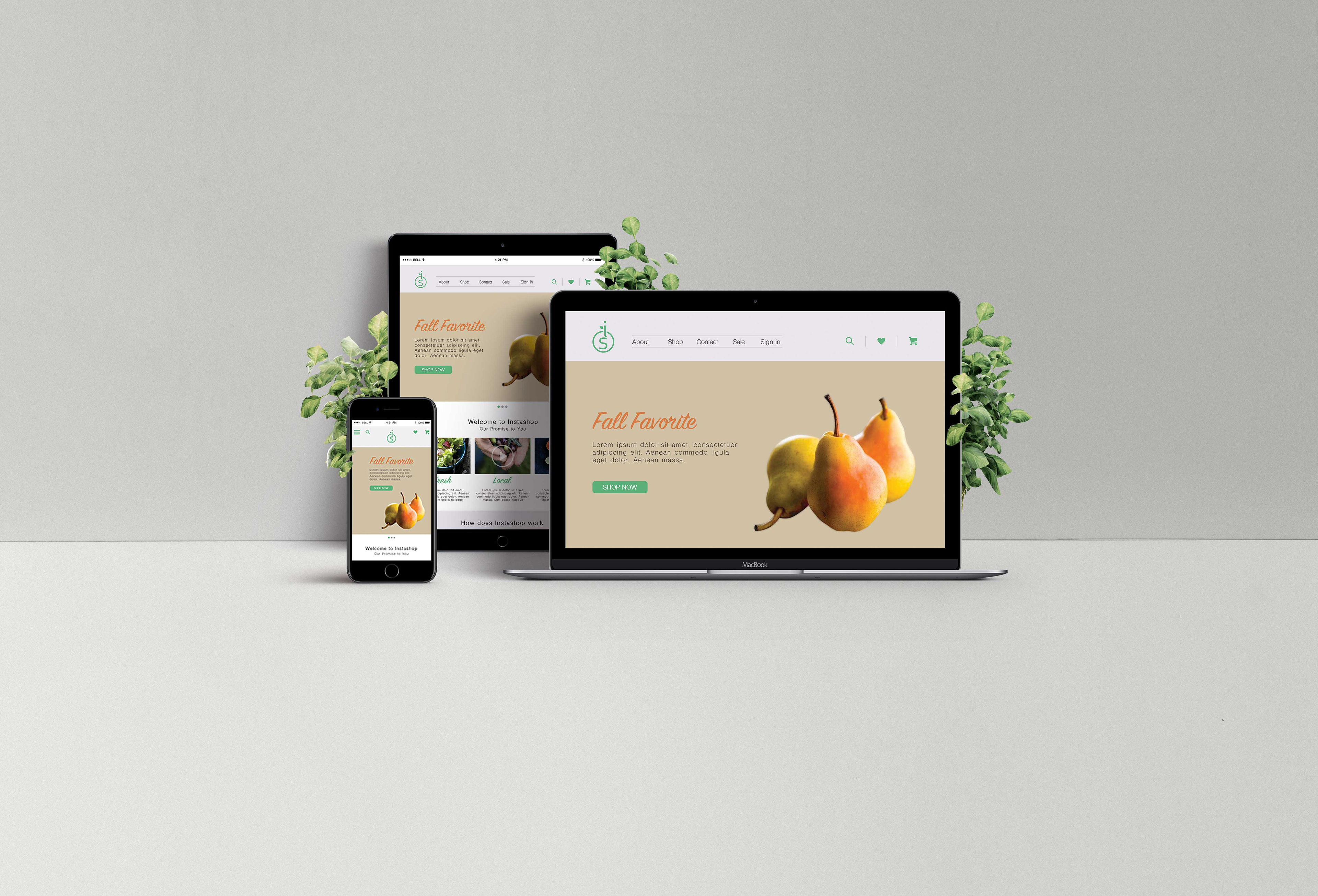
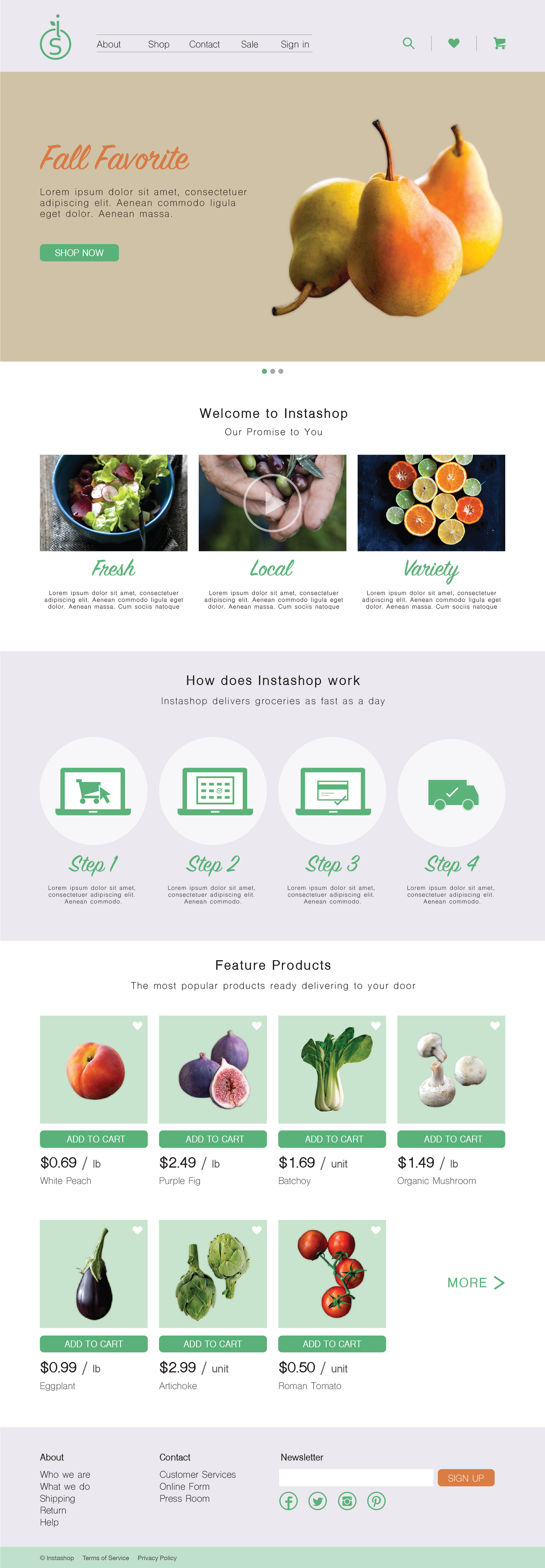
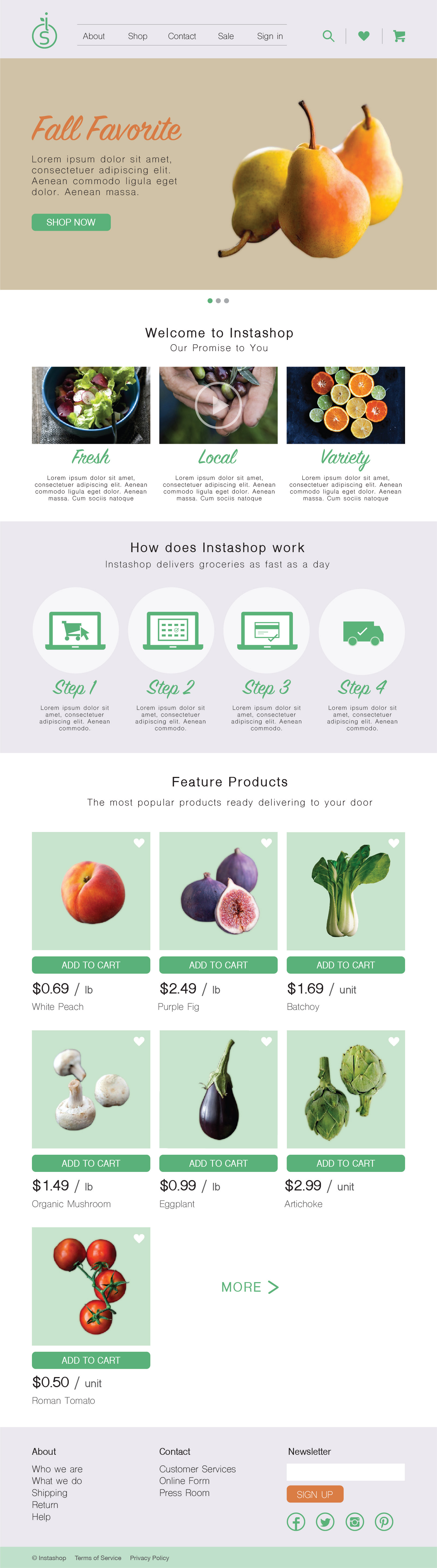
Responsive Wireframe
Responsive wireframe on web, tablet and mobile screens. I used 960 grid system for the design.
The right is shown the home page design. The design is changing moving from bigger screen to the smaller screen.
STEP 4 - Prototype
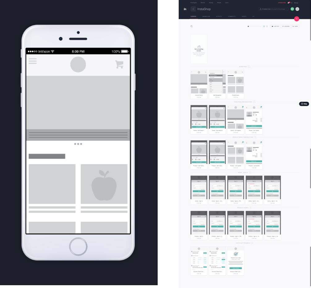
Invision APP Prototyping
A working prototype is created using Invision APP. Learn More.
I created a tasking flow from looking for items to check out. The prototypes pages are included:
- Home page
- Side navigation page
- Product page
- Product detail modal window
- Cart review page
- Sign in page
- Check out page
- Confirmation page
I created a tasking flow from looking for items to check out. The prototypes pages are included:
- Home page
- Side navigation page
- Product page
- Product detail modal window
- Cart review page
- Sign in page
- Check out page
- Confirmation page
STEP 5 - Test
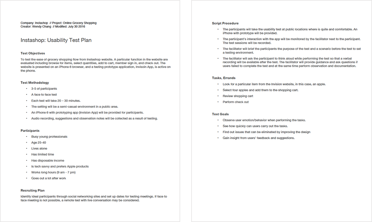
In-person Usability Testing Plan
Using Invision APP prototype that I created I conducted a in-person usability testing. Before the test, a test plan is written out following Erika Hall’s Test Plan Checklist.
I recruited total five participants and gave them a scenario that they are busy and don’t have time do grocery shopping. They need four apples in two days to prepare for a dinner party for close friends. That’s why they are on Instashop homepage trying to buy four apples.
The goal for usability testing is to find out how well the prototype is designed and what insights the participants can tell you.
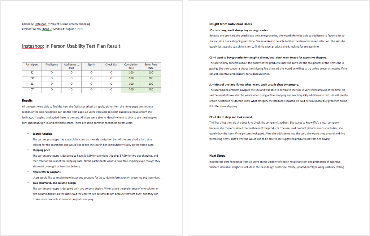
In-person Usability Testing Result
All the participants completed the task flow from finding product to successfully checking out. I got good feedback on the visibility of search function. I also got some good insight from individual users.
Online Usability Testing
In addition to in-person usability testing, I also conduct online surveys on my prototype using Verify App and Usability Hub.
- Verify App Multi page click test Question test
- Usability Hub Preferences test Navigation test
I have total 25 participants doing my online usability test. Most of the result support in-person usability testing findings and few has a different results that are analysis for the next prototype design.

Online Usability Testing Result
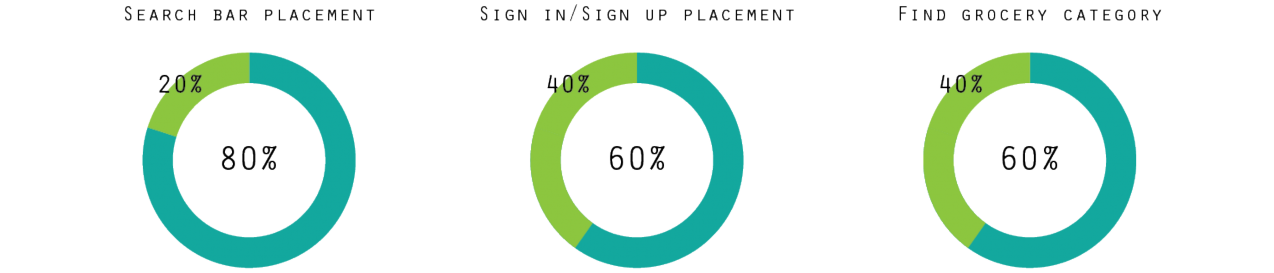
80% of participants prefer to have the search function located near the hero graphic on the home page. The result support in-person usability testing finding.
60% of participants prefer to have the sign in/ sign up button located on the top of the home page. The result support in-person usability testing finding.
60% of participants are expect to click on the side navigation to find more grocery category and shop from there. The result support in-person usability testing finding.

80% of participants expect to see a new pop-up window telling they have successfully added an item in the cart. The result is opposite from the in-person finding.
The solution may be a miro-interaction design to support both in-person and online usability testing findings.
100% of participants prefer to see two column design displaying product images. The result support in-person usability testing finding.
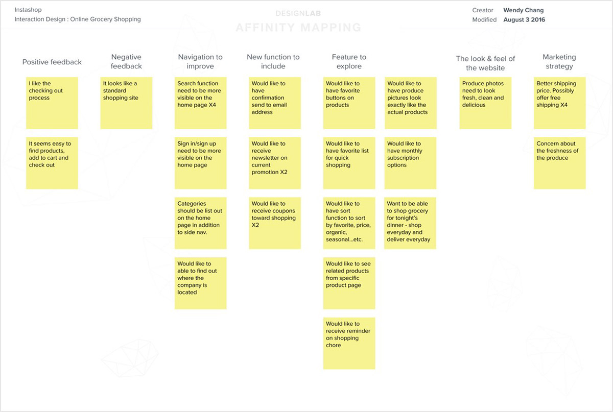
Affinity Map
Using usability research document, I created an affinity map to help sort, prioritize and rank user testing feedback. This will also help me for the next version of the prototyping design.
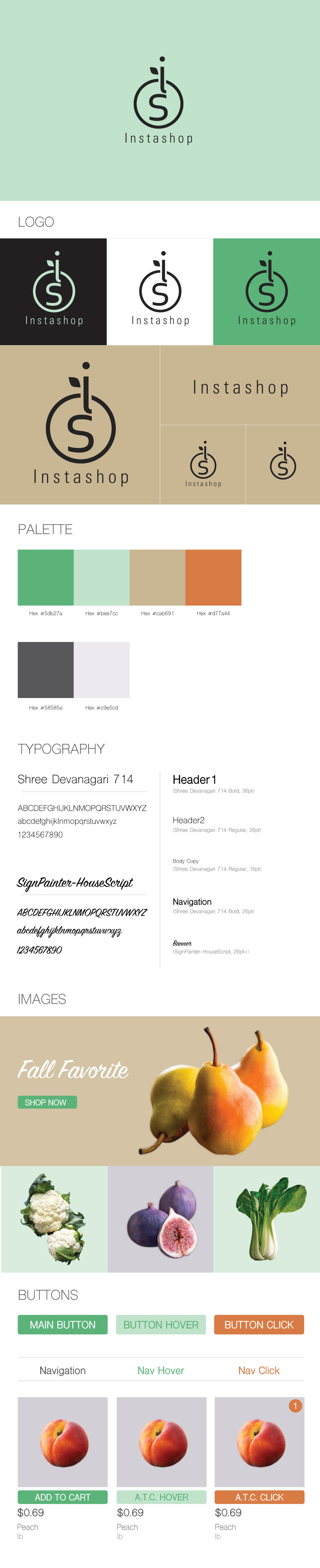
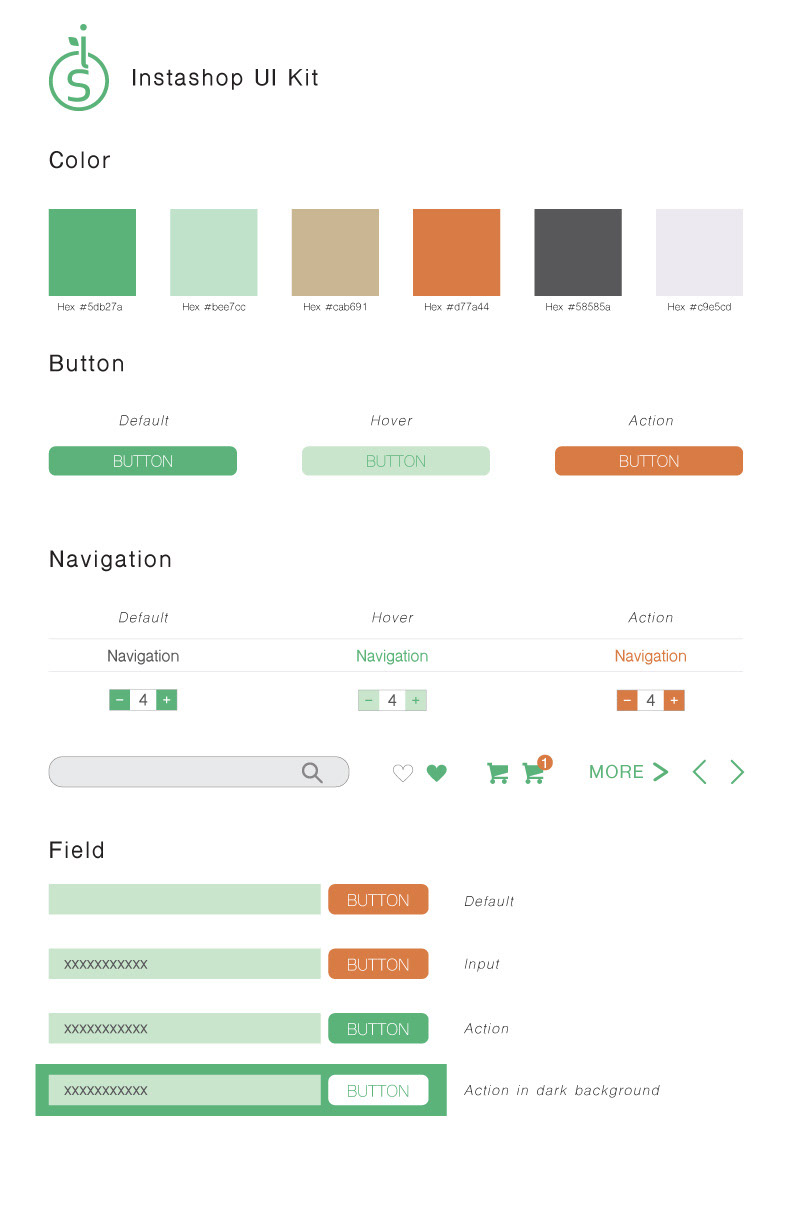
Interface Design
Style Tile and UI Kit
960px web screen
786px tablet screen

320px mobile screen